Over the past few months, PRISMOJI has diligently blazed new trails in the emerging field of emoji data science. Today, in a commitment to open data science and open data journalism, we’re proud to present our first tutorial on emoji data science in R. This tutorial is meant to complement our latest article on Emojipedia: “The resistance will be emojified ✊🏽.” (You can find raw code and data to accompany this tutorial in the accompanying Github repository here.)
In this tutorial, we’ll cover:
- Part 1 💻: Downloading Twitter data using R
- Part 2 ✍🏼: Using Unicode pattern matching to extract emojis from tweets
- Part 3 📊: Visualizing emojis (Basic)
- Part 4 🤓: Visualizing emojis (Advanced)
- Part 5 🚀: Next steps
Part 1 💻: Downloading Twitter data using R
Downloading Twitter data using R has been fairly well documented. Here, we’ll access the Twitter Search API using the twitteR package. First, log into your twitter account, then head to https://apps.twitter.com/, click “Create New App”, fill in the details, and click “Create your Twitter application.” Now click “Keys and Access Tokens”, and click “Create my access token.”
The resulting screen should provide you four strings that you’ll need to access Twitter data: “Consumer Key (API Key)”, “Consumer Secret (API Secret)”, “Access Token”, and “Access Token Secret.” These are all uniquely associated with your Twitter account and you should not share these with anyone else. Now, we can download Twitter data using just a few lines of code.
This code snippet will get you authenticated with Twitter (just replace XXX with the value of each string from above):
library(twitteR)
library(reshape)
api_key <- 'XXX'
api_secret <- 'XXX'
access_token <- 'XXX'
access_token_secret <- 'XXX'
setup_twitter_oauth(api_key, api_secret, access_token, access_token_secret)
Now, we’re ready to pull tweets. We use the searchTwitter function which requires us to specify a search term; here, we’ll use #nobannowall. Bogdan Rau has a good overview of other types of valid search terms, but in general, anything that works at twitter.com/search should work here. The n parameter is important. Generally, we’ve found that you can request n=100,000 tweets which will usually lead to rate-limiting but will still give you results within about 30-60 minutes. (For sparse hashtags, it will return fewer tweets.)
In terms of date range, the Search API in general only goes back 7-10 days at most, and is often delayed by a day or so for current tweets, so keep this in mind. An important note: for a highly popular hashtag, the Search API does not return a representative distribution of tweets (i.e. if you request tweets from Feb. 1 – Feb 5, it’s likely you’ll only get tweets from Feb. 5). One workaround is to pull tweets from different days separately. Also, we remove retweets because this helps us get cleaner emoji data but you can toggle this parameter. df here returns a dataset with many variables, most of which are unnecessary for our work; you can choose to retain them if you wish.
Here’s the code:
set.seed(20170202); ht <- '#nobannowall';
tweets.raw <- searchTwitter(ht, n = 1000, lang = 'en', since = '2017-01-29', until = '2017-01-29');
df <- twListToDF(strip_retweets(tweets.raw, strip_manual = TRUE, strip_mt = TRUE)); df$hashtag <- ht; df$created <- as.POSIXlt(df$created); df$text <- iconv(df$text, 'latin1', 'ASCII', 'byte'); df$url <- paste0('https://twitter.com/', df$screenName, '/status/', df$id); df <- rename(df, c(retweetCount = 'retweets'));
df.a <- subset(df, select = c(text, created, url, latitude, longitude, retweets, hashtag));
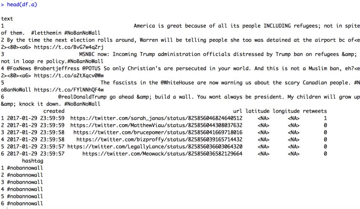
nrow(df.a); head(df.a);
setwd('.../PRISMOJI/tutorial'); write.csv(df.a, paste0('tweets.cleaned_', format(min(df.a$created), '%m%d'), '-', format(max(df.a$created), '%m%d'), '_', ht, '_', Sys.Date(), '_', format(Sys.time(), '%H-%M-%S'), '_n', nrow(df.a), '.csv'), row.names = FALSE);
tweets <- df; tweets$z <- 1; tweets$created <- as.POSIXlt(tweets$created); nrow(tweets); min(tweets$created); max(tweets$created); median(tweets$created);
Curious what the output looks like? Here’s a screenshot:
Part 2 ✍🏼: Using Unicode pattern matching to extract emojis from tweets
Using the methodology described in Part 1, we read in tweets, separately for Jan. 28 and Jan. 29, for five different hashtags: #NoBanNoWall, #NoMuslimBan, #NotMyPresident, #TheResistance, and #WomensMarch. (Here is a good resource for hashtag brainstorming which will give you a network of related hashtags for a given seed hashtag.)
Within each of the five resulting datasets, we deduplicated tweets by both URL and user name. (For example, there are often Twitter bot accounts that tweet multiple times, using identical text and/or emojis, which can distort results.) We then combined these into one dataset which you can find on Github called “tutorial_tweets_raw.csv.”
We then download two emoji dictionaries – one provided by Lauren Ancona and Chris Tufts whose earlier work on emojis in Philadelphia was an invaluable starting point in our own work, and the other by Jessica Peterka-Bonetta who built a powerful emoji decoder specifically for R. We combine these dictionaries into a new dataset called emojis.
⁎ As a caveat, both of these dictionaries contain only 842 emojis and are slightly out of date with the latest and greatest emojis. Updating these to be current would be really cool! Please drop us a line if you get a chance to work on this 🙂
[UPDATE (10/5/2017): The linguist Kate Lyons of the University of Illinois – who has done great work producing emoji maps of San Francisco – has created an updated emoji dictionary covering 2,204 emojis, including skin tone emojis! This is a tremendous contribution to emoji research and we look forward to using her dictionary going forward.]
Using our new emoji dictionary – which has a column named rencoding to represent
how R represents each emoji – we compare our dataset of 57,522 tweets with our dataset of 842 emojis and create a full matrix (57,522 x 842) to assess the presence of each emoji in each tweet. This is the most time-consuming part but using sapply and vectorization, it runs in less than 3 minutes here. We save the resultant matrix as tweets.emojis.matrix and then run colSums across each column to compute an initial emoji count.
Here’s the code:
tweets <- tweets.final;
# tweets <- subset(tweets.final, hashtag %in% c('#womensmarch'));
## create full tweets by emojis matrix
df.s <- matrix(NA, nrow = nrow(tweets), ncol = ncol(emojis));
system.time(df.s <- sapply(emojis$rencoding, regexpr, tweets$text, ignore.case = T, useBytes = T));
rownames(df.s) <- 1:nrow(df.s); colnames(df.s) <- 1:ncol(df.s); df.t <- data.frame(df.s); df.t$tweetid <- tweets$tweetid;
# merge in hashtag data from original tweets dataset
df.a <- subset(tweets, select = c(tweetid, hashtag));
df.u <- merge(df.t, df.a, by = 'tweetid'); df.u$z <- 1; df.u <- arrange(df.u, tweetid);
tweets.emojis.matrix <- df.u;
## create emoji count dataset
df <- subset(tweets.emojis.matrix)[, c(2:843)]; count  -1);
emojis.m <- cbind(count, emojis); emojis.m <- arrange(emojis.m, desc(count));
emojis.count  1); emojis.count$dens <- round(1000 * (emojis.count$count / nrow(tweets)), 1); emojis.count$dens.sm <- (emojis.count$count + 1) / (nrow(tweets) + 1);
emojis.count$rank <- as.numeric(row.names(emojis.count));
emojis.count.p <- subset(emojis.count, select = c(name, dens, count, rank));
# print summary stats
subset(emojis.count.p, rank <= 10);
num.tweets <- nrow(tweets); df.t  -1); num.tweets.with.emojis  0]); num.emojis <- sum(emojis.count$count);
min(tweets$created); max(tweets$created); median(tweets$created);
num.tweets; num.tweets.with.emojis; round(100 * (num.tweets.with.emojis / num.tweets), 1); num.emojis; nrow(emojis.count);
Here’s what the output looks like:
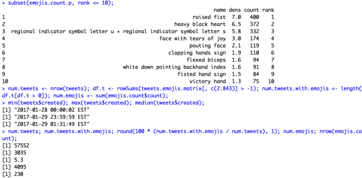
Pretty cool! 😎
Part 3 📊: Visualizing emojis
The table above is nice to look at it, but is there a prettier way we can visualize the data in emojis.count? A simple approach is to make a bar chart of top emojis where we insert the appropriate emoji image on top of each of the bars using the annotation_custom function in ggplot. (If you’re trying to replicate this in other languages, i.e. Python, try searching for custom plot annotations.) In order to do this, we first read in all 842 emoji images using grid::rasterGrob.
Here’s what the code looks like:
df.plot <- subset(emojis.count.p, rank <= 10); xlab <- 'Rank'; ylab <- 'Overall Frequency (per 1,000 Tweets)';
setwd('.../PRISMOJI/tutorial/ios_9_3_emoji_files'); df.plot <- arrange(df.plot, name);
imgs <- lapply(paste0(df.plot$name, '.png'), png::readPNG); g <- lapply(imgs, grid::rasterGrob);
k <- 0.20 * (10/nrow(df.plot)) * max(df.plot$dens); df.plot$xsize <- k; df.plot$ysize <- k; df.plot$ysize <- k * (df.plot$dens / max(df.plot$dens));
df.plot <- arrange(df.plot, name);
g1 <- ggplot(data = df.plot, aes(x = rank, y = dens)) +
  geom_bar(stat = 'identity', fill = 'dodgerblue4') +
  xlab(xlab) + ylab(ylab) +
  mapply(function(x, y, i) {
    annotation_custom(g[[i]], xmin = x-0.5*df.plot$xsize[i], xmax = x+0.5*df.plot$xsize[i],
                      ymin = y-0.5*df.plot$ysize[i], ymax = y+0.5*df.plot$ysize[i])},
    df.plot$rank, df.plot$dens, seq_len(nrow(df.plot))) +
  scale_x_continuous(expand = c(0, 0), breaks = seq(1, nrow(df.plot), 1), labels = seq(1, nrow(df.plot), 1)) +
  scale_y_continuous(expand = c(0, 0), limits = c(0, 1.10 * max(df.plot$dens))) +
  theme(panel.grid.minor.y = element_blank(),
        axis.title.x = element_text(size = 10), axis.title.y = element_text(size = 14),
        axis.text.x  = element_text(size = 8, colour = 'black'), axis.text.y  = element_text(size = 8, colour = 'black'));
g1;
setwd('.../PRISMOJI/tutorial')
png(paste0('emoji_barchart_', as.Date(min(tweets$created)), '_', as.Date(max(tweets$created)), '_', Sys.Date(), '_', format(Sys.time(), '%H-%M-%S'), '_n', nrow(tweets), '.png'),
    width = 6600, height = 4000, units = 'px', res = 1000);
g1; dev.off();
The output looks like this:

⁎ We can tweak the tweets assignment in Part 2 above, right before we run create tweets.emojis.matrix, to replicate the above analysis for a given subset of the dataset instead of running it on all tweets.
Part 4 🤓: Visualizing emojis (Advanced)
The next step after visualizing the top emojis in the overall dataset is to compare emoji frequency between two different subsets of the data. In order to do this efficiently, we first create a reduced representation of the tweets.emojis.matrix that has the original tweet appended with a string of all the unique emojis in that tweet.
This code is fairly straightforward:
df.s <- data.frame(matrix(NA, nrow = nrow(tweets), ncol = 2)); names(df.s) <- c('tweetid', 'emoji.ids'); df.s$tweetid <- 1:nrow(tweets);
system.time(df.s$emoji.ids  -1), sep = '', collapse = ', ')));
system.time(df.s$num.emojis <- sapply(df.s$emoji.ids, function(x) length(unlist(strsplit(x, ', ')))));
df.s.emojis  0);
df.s.nonemojis <- subset(df.s, num.emojis == 0); df.s.nonemojis$emoji.names <- '';
# convert to long, only for nonzero entries
df.l <- cSplit(df.s.emojis, splitCols = 'emoji.ids', sep = ', ', direction = 'long')
map <- subset(emojis, select = c(emojiid, name)); map$emojiid <- as.numeric(map$emojiid);
df.m <- merge(df.l, map, by.x = 'emoji.ids', by.y = 'emojiid'); df.m <- arrange(df.m, tweetid); df.m <- rename(df.m, c(name = 'emoji.name'));
tweets.emojis.long <- subset(df.m, select = c(tweetid, emoji.name));
df.n <- aggregate(emoji.name ~ tweetid, paste, collapse = ', ', data = df.m);
## merge back with original tweets dataset
df.f <- merge(df.s.emojis, df.n, by = 'tweetid'); df.f <- rename(df.f, c(emoji.name = 'emoji.names'));
df.g <- rbind(df.f, df.s.nonemojis); df.g <- arrange(df.g, tweetid);
df.h <- merge(tweets, df.g, by = 'tweetid', all.x = TRUE); df.h$emoji.ids <- NULL; df.h$tweetid <- as.numeric(df.h$tweetid); df.h <- arrange(df.h, tweetid);
tweets.emojis <- df.h;
Now, we define two different subsets of the data, then count the emojis in those subsets based on tweets.emojis. For example, let’s compare emoji usage between tweets mentioning #womensmarch and tweets mentioning #theresistance. First, we create the two subsets, count emojis in each subset, and create a combined dataset to facilitate comparisons:
df.1 <- subset(tweets.emojis, grepl(paste(c('#womensmarch'), collapse = '|'), tolower(tweets.emojis$text)));
df.2 <- subset(tweets.emojis, grepl(paste(c('#theresistance'), collapse = '|'), tolower(tweets.emojis$text)));
nrow(df.1); nrow(df.2);
# dataset 1
df.a <- subset(subset(df.1, emoji.names != ''), select = c(tweetid, emoji.names)); df.a$emoji.names <- as.character(df.a$emoji.names);
df.b <- data.frame(table(unlist(strsplit(df.a$emoji.names, ',')))); names(df.b) <- c('var', 'freq'); df.b$var <- trimws(df.b$var, 'both'); df.b <- subset(df.b, var != '');
df.c <- aggregate(freq ~ var, data = df.b, function(x) sum(x)); df.c <- df.c[with(df.c, order(-freq)), ]; row.names(df.c) <- NULL;
df.d  1); df.d$dens <- round(1000 * (df.d$freq / nrow(df)), 1); df.d$dens.sm <- (df.d$freq + 1) / (nrow(df) + 1); df.d$rank <- as.numeric(row.names(df.d)); df.d <- rename(df.d, c(var = 'name'));
df.e <- subset(df.d, select = c(name, dens, dens.sm, freq, rank));
df.e$ht <- as.character(arrange(data.frame(table(tolower(unlist(str_extract_all(df.1$text, '#\\w+'))))), -Freq)$Var1[1]);
df.e[1:10, ]; emojis.count.1 <- df.e;
# dataset 2
df.a <- subset(subset(df.2, emoji.names != ''), select = c(tweetid, emoji.names)); df.a$emoji.names <- as.character(df.a$emoji.names);
df.b <- data.frame(table(unlist(strsplit(df.a$emoji.names, ',')))); names(df.b) <- c('var', 'freq'); df.b$var <- trimws(df.b$var, 'both'); df.b <- subset(df.b, var != '');
df.c <- aggregate(freq ~ var, data = df.b, function(x) sum(x)); df.c <- df.c[with(df.c, order(-freq)), ]; row.names(df.c) <- NULL;
df.d  1); df.d$dens <- round(1000 * (df.d$freq / nrow(df)), 1); df.d$dens.sm <- (df.d$freq + 1) / (nrow(df) + 1); df.d$rank <- as.numeric(row.names(df.d)); df.d <- rename(df.d, c(var = 'name'));
df.e <- subset(df.d, select = c(name, dens, dens.sm, freq, rank));
df.e$ht <- as.character(arrange(data.frame(table(tolower(unlist(str_extract_all(df.2$text, '#\\w+'))))), -Freq)$Var1[1]);
df.e[1:10, ]; emojis.count.2 <- df.e;
# combine datasets and create final dataset
names(emojis.count.1)[-1] <- paste0(names(emojis.count.1)[-1], '.1'); names(emojis.count.2)[-1]  0 & (df.a$dens.2 > df.a$dens.1), -1 * round(100 * ((df.a$dens.2 / df.a$dens.1) - 1), 0), NA));
df.a$logor <- log(df.a$dens.sm.1 / df.a$dens.sm.2);
df.a$dens.mean  0); nrow(df.b);
df.c <- subset(df.b, select = c(name, dens.1, dens.2, freq.1, freq.2, dens.mean, round(logor, 2)));
df.c <- df.c[with(df.c, order(-logor)), ]; row.names(df.c) <- NULL; nrow(df.c); df.c;
emojis.comp.p <- df.c;
The key parameter here is k, which sets a threshold for how many emojis we want in the final comparison dataset, and df.b more broadly defines that dataset. (Here, the comparison dataset contains emojis that rank in the top 50 in either subset, have a frequency of at least 5 in either dataset, and are greater than zero in both datasets. Another useful parameter option could be to threshold on abs(logor) being greater than 0.5 or 1 which will yield only the most polarized emojis. Regardless, we print nrow(df.b) to give us a sense of how many emojis the thresholding criteria yield.
Here’s a snippet of the first and last 5 observations from the resulting emoji comparison dataset, emojis.comp.p:
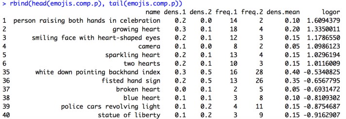
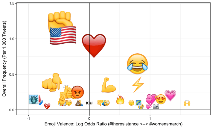
The results are interesting and seem intuitive. Pink hearts and celebratory emojis over-index on #womensmarch while more activist emojis and New York-specific ones overindex on #theresistance. (Emojis more associated with the first dataset we defined, df.1, end up with a positive odds ratio, and vice-versa. Odds ratios close to 0 indicate emojis that are used equally frequently with both hashtags.)
Now, visualizing the two-way spread of emojis across both datasets is trivial given our earlier foundations; namely, we can use custom annotations to plot log odds ratios and overall densities on an x-y plane.
Here’s the code:
setwd('.../PRISMOJI/tutorial/ios_9_3_emoji_files');
df.t <- arrange(emojis.comp.p, name);
imgs <- lapply(paste0(df.t$name, '.png'), png::readPNG)
g <- lapply(imgs, grid::rasterGrob);
## make plot
df.t <- arrange(emojis.comp.p, logor)
xlab <- paste0('Emoji Valence: Log Odds Ratio (', paste0(unique(emojis.count.2$ht), '  ', unique(emojis.count.1$ht), ')'));
ylab <- 'Overall Frequency (Per 1,000 Tweets)'
k <- 8 # size parameter for median element
xsize <- (k/100) * (max(df.t$logor) - min(df.t$logor)); ysize <- (k/100) * (max(df.t$dens.mean) - min(df.t$dens.mean));
df.t$xsize <- xsize; df.t$ysize <- ysize;
df.t$dens.m  median(df.t$dens.mean), round(sqrt((df.t$dens.mean / min(df.t$dens.mean))), 2), 1);
df.t$xsize <- df.t$dens.m * df.t$xsize; df.t$ysize <- df.t$dens.m * df.t$ysize;
df.t <- arrange(df.t, name);
g1 <- ggplot(df.t, aes(jitter(logor), dens.mean)) +
  xlab(xlab) + ylab(ylab) +
  mapply(function(x, y, i) {
    annotation_custom(g[[i]], xmin = x-0.5*df.t$xsize[i], xmax = x+0.5*df.t$xsize[i],
                      ymin = y-0.5*df.t$ysize[i], ymax = y+0.5*df.t$ysize[i])},
    jitter(df.t$logor), df.t$dens.mean, seq_len(nrow(df.t))) +
  scale_x_continuous(limits = c(1.15 * min(df.t$logor), 1.15 * max(df.t$logor))) +
  scale_y_continuous(limits = c(0, 1.20 * max(df.t$dens.mean))) +
  geom_vline(xintercept = 0) + geom_hline(yintercept = 0) +
  theme_bw() +
  theme(axis.title.x = element_text(size = 10), axis.title.y = element_text(size = 10),
        axis.text.x  = element_text(size = 8, colour = 'black'), axis.text.y  = element_text(size = 8, colour = 'black'));
setwd('.../PRISMOJI/tutorial');
png(paste0('emojis.comp.p_', Sys.Date(), '_', format(Sys.time(), '%H-%M-%S'), '.png'),
    width = 6600, height = 4000, units = 'px', res = 1000);
g1; dev.off();
And here’s the output:
Part 5 🚀: Next Steps
In our next tutorial, we’ll dig a little deeper into text analysis of datasets with emojis. Meanwhile, given this foundation of emoji data science, there are a few next steps we can imagine:
- emoji network visualizations to understand emoji-emoji cooccurrence (i.e. Mailchimp published a great analysis in 2015)
- interactive emoji dashboards (i.e. we’re big fans of the University of Virginia’s Twitter Visualization Project and their time series plot of emoji usage during the presidential debates.)
- updating the above protocol to include the latest batch of 1,851 emoji characters in Unicode 9.0
- using machine learning and natural language processing to better leverage the text data in tweets to understand what emojis mean
- replicating the above protocol for Instagram and other social media platforms
If you’re interested in working with us on any of the above – or have your own ideas – email us at hello@prismoji.com! We’re happy to chat with prospective interns, especially people with data science or engineering backgrounds who are natural storytellers and can see the forest from the trees.
By Hamdan Azhar

4 thoughts on “Emoji data science in R: A tutorial”