Today, we published our first article in Forbes breaking down the more than $1 billion spent so far in the US presidential election. Check out the entire piece which includes great visualizations from their design team.
Sometimes, a map is easier to understand, and we wanted to share the data in a way that hasn’t really been done before. So here it is.
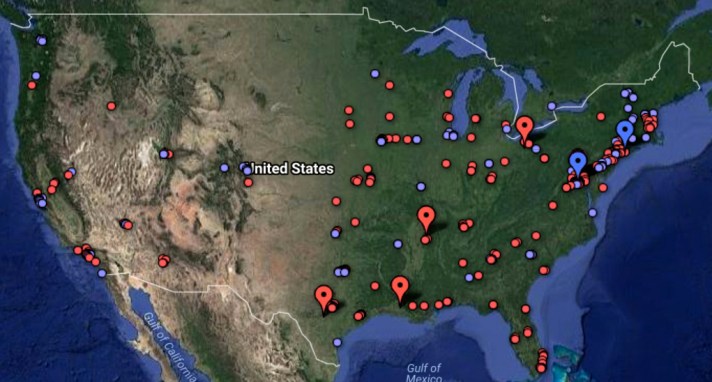
One interactive map, where each point represents an individual or organization that received at least $100,000 from one of the top seven presidential campaigns this season. In total, the 565 points on this map represent $775.8 million in spending. (Red is for spending by Republican candidates and blue for Democrats. The larger markers indicate organizations that received at least $10 million.)
You can also poke around the summarized data here:

Let us know if you find anything interesting!
